

Every year, color experts announce what’s “in,” and every year, most of us quietly ask the same question: Will I still like this once I actually live with it?
For 2026, the answer feels refreshingly simple. Yes. Probably. And you won’t hate yourself for it later.
The 2026 Colors of the Year aren’t about shock value or statement walls you’ll repaint by fall. They’re about calm, warmth, and colors that support real life. The kind of shades that make your home feel finished instead of fussy.
Pantone’s 2026 Color of the Year sets the tone, but the real story shows up when you look at what major paint brands are choosing alongside it. Together, they tell a clear story: quiet confidence is back.
What Are the Colors of the Year for 2026?
There isn’t just one Color of the Year anymore - and honestly, that’s a good thing.
Each year, color authorities and paint brands release their own picks based on cultural shifts, design behavior, and how people are actually living. When you look at them together, patterns emerge. And for 2026, the pattern is unmistakable.
Across brands, the colors of the year point to:
- Softer contrast
- Warmer undertones
- Livable, grounding hues
- A move away from visual noise
These tones work well when layered with natural materials like wood, stone, linen, and bronze… starting small - with throw pillows, art, and textiles - creates interiors that feel both current and comforting.- Kerrie Kelly, designer and owner of Kirrie Kelly Studio
Pantone introduces the emotional framework. Paint brands translate that idea into colors people will actually put on their walls. When those two align, you get a trend worth paying attention to.

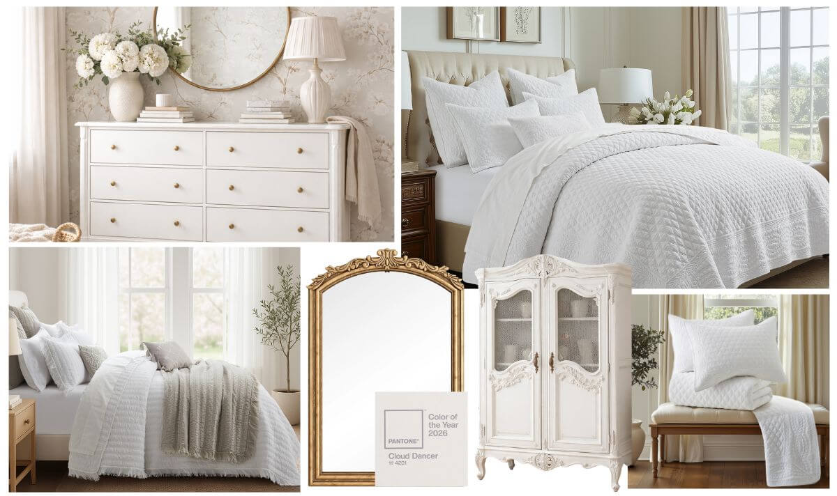
The 2026 Pantone Color of the Year: Cloud Dancer
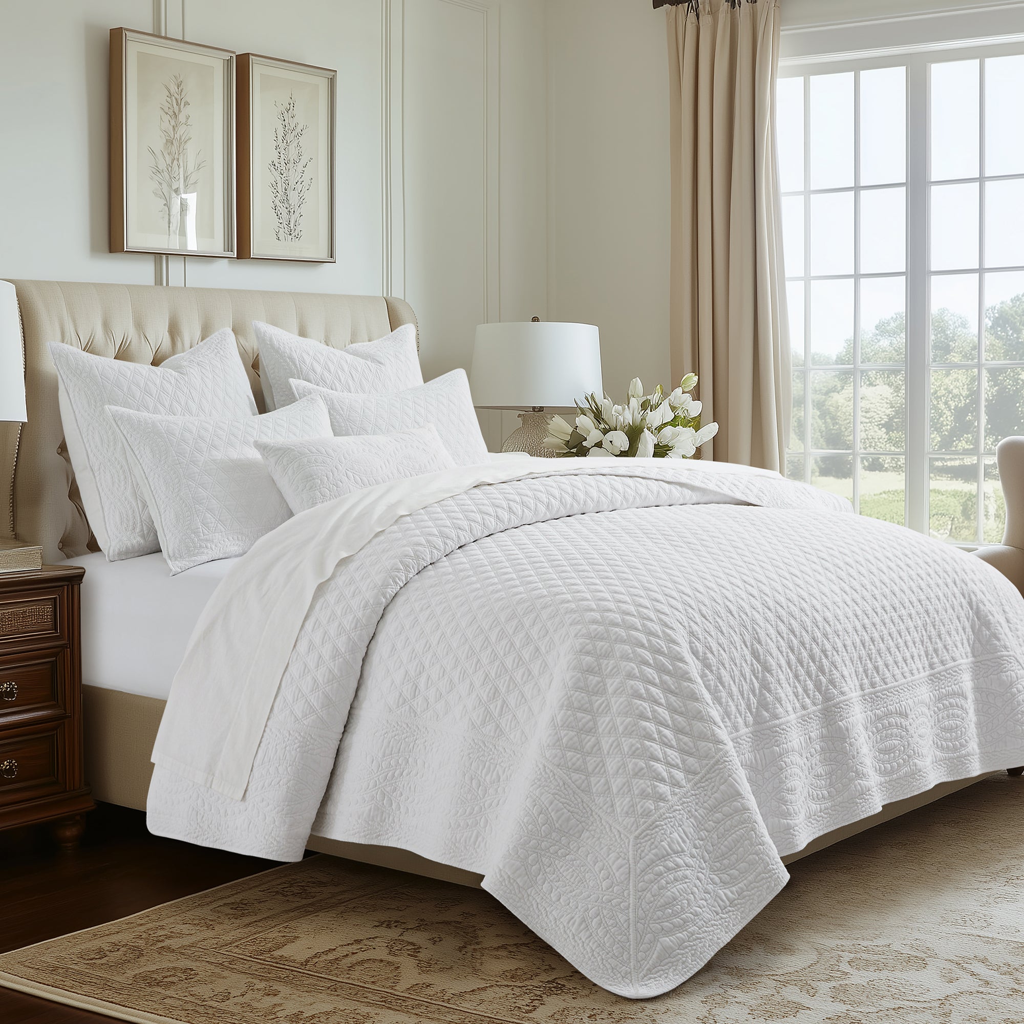
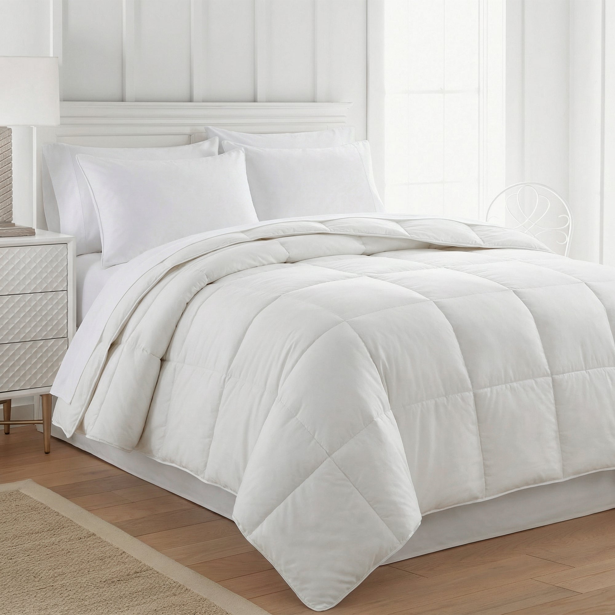
Pantone named Cloud Dancer (PANTONE 11-4201) as its 2026 Color of the Year, and for once, the name fits.
This is a white - but not the harsh, blinding white that makes your home feel like a medical facility. Cloud Dancer is softer. Calmer. It knows when to stay in its lane.
Pantone describes it as a response to overstimulation and visual noise, which feels about right. We’ve all had enough of everything competing for our attention. Cloud Dancer doesn’t demand anything. It supports what’s already there.
Think of it as the neutral that lets other colors shine without disappearing entirely. It’s not here to be impressive. It’s here to be useful.
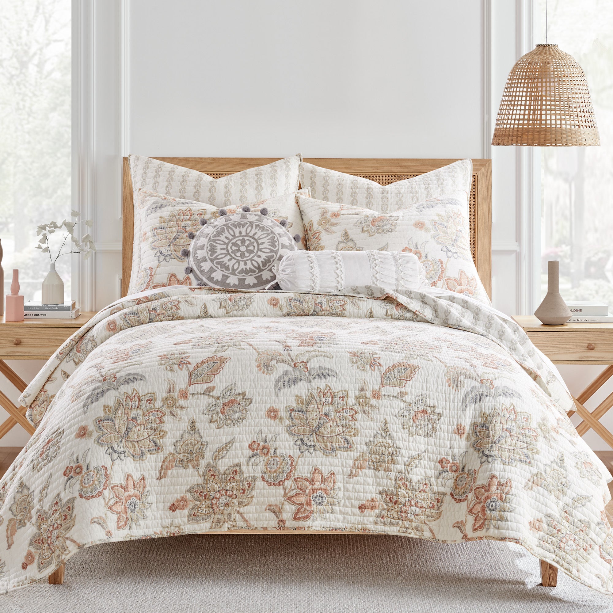
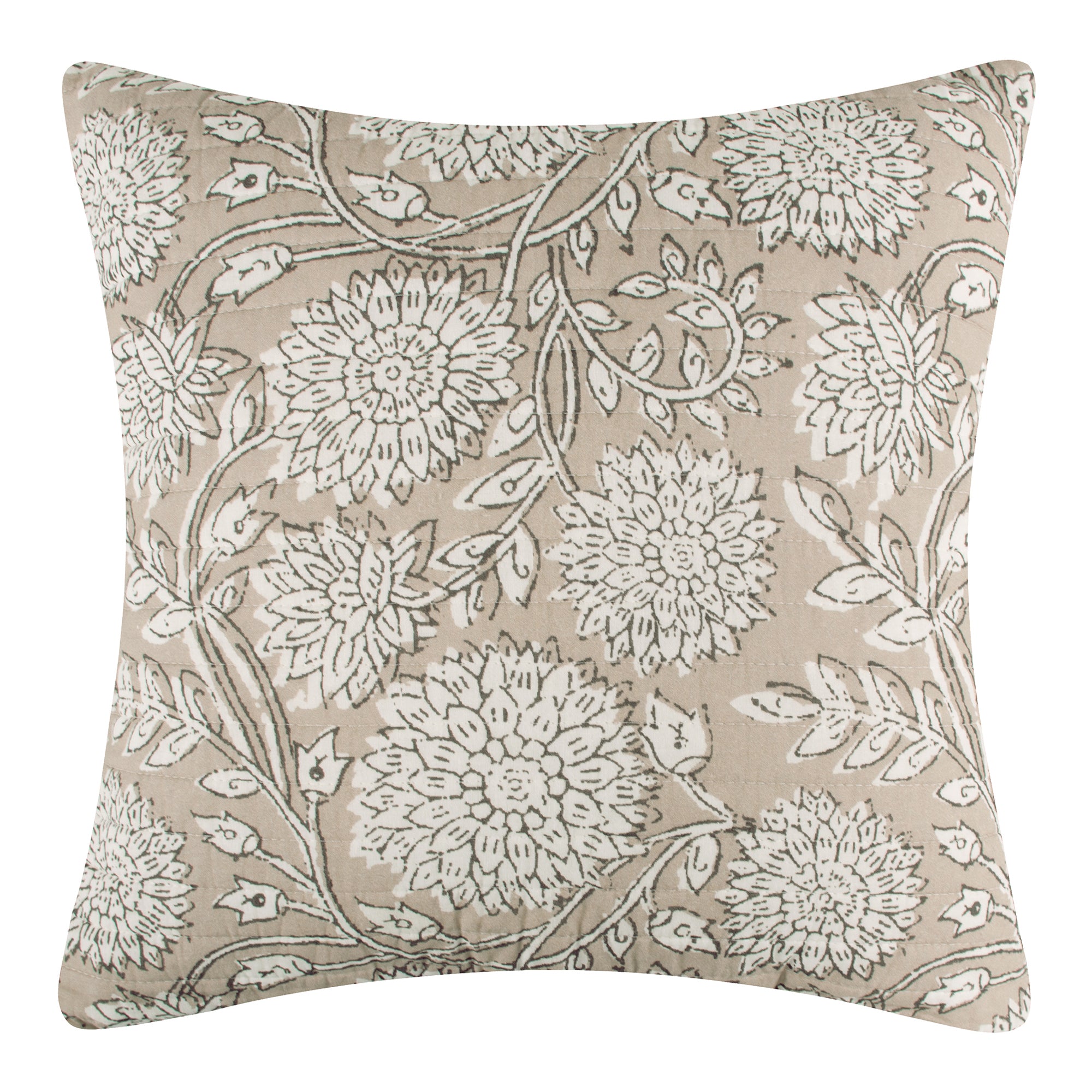
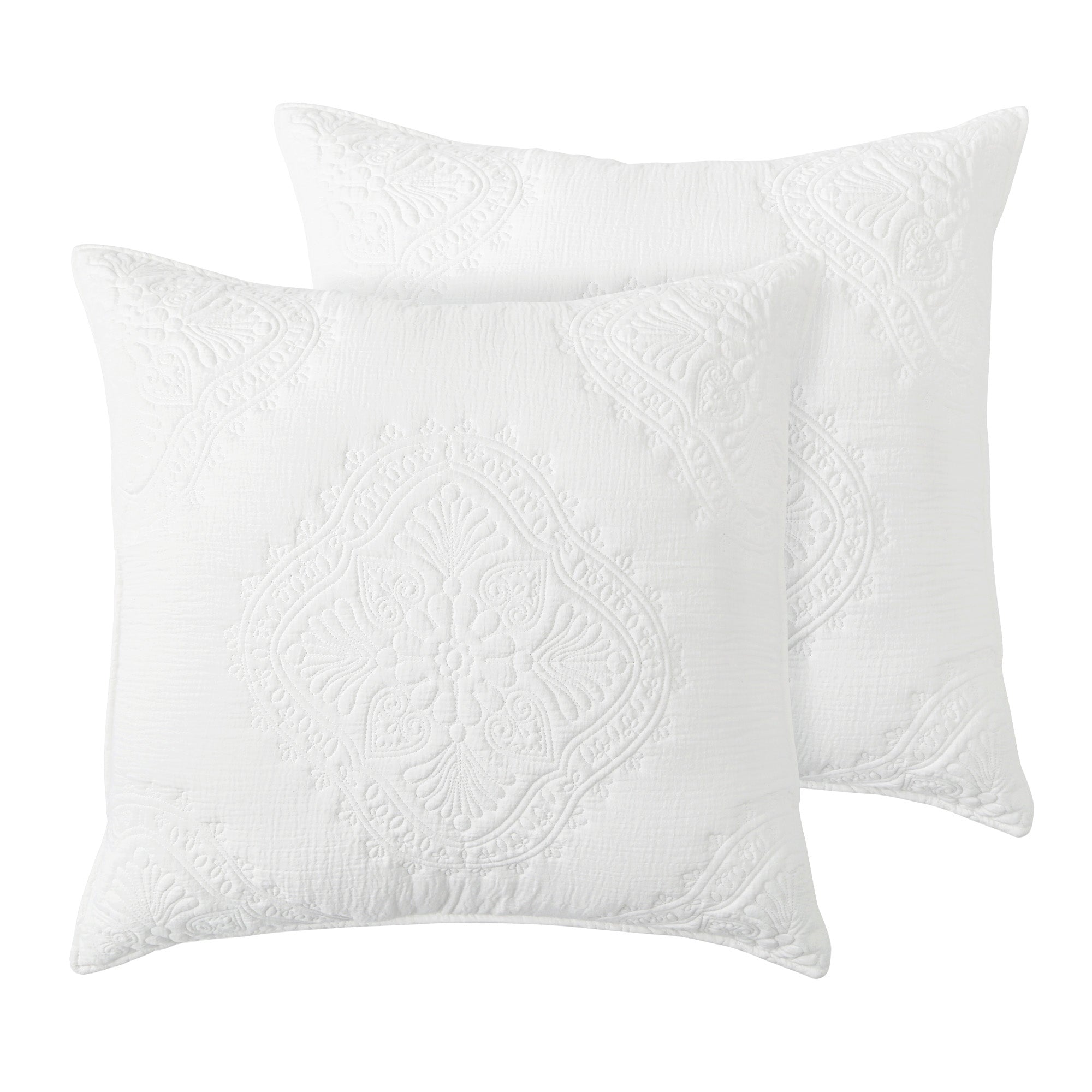
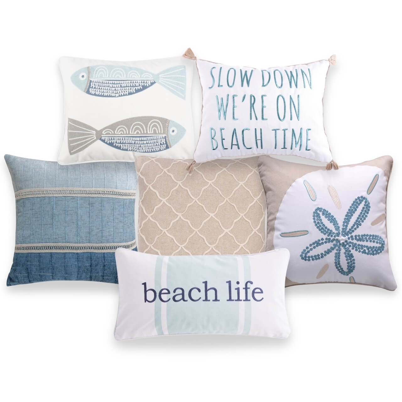
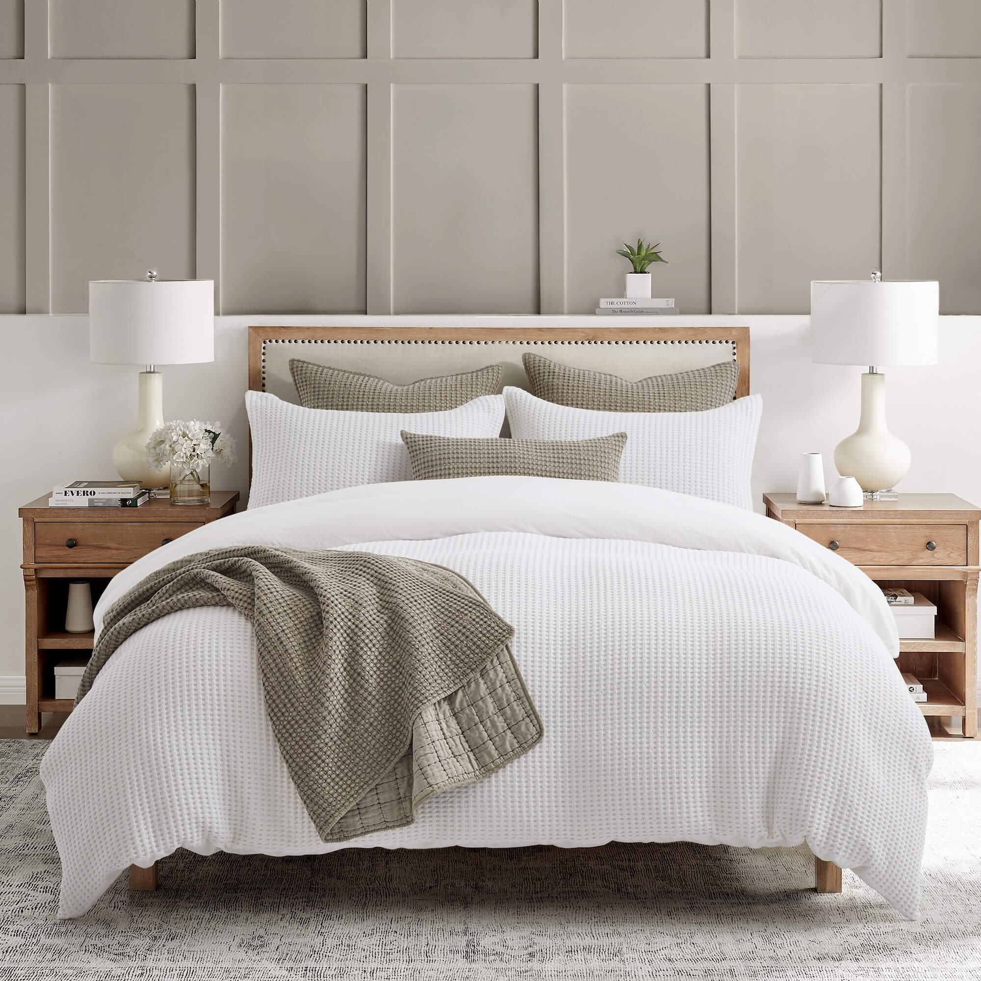
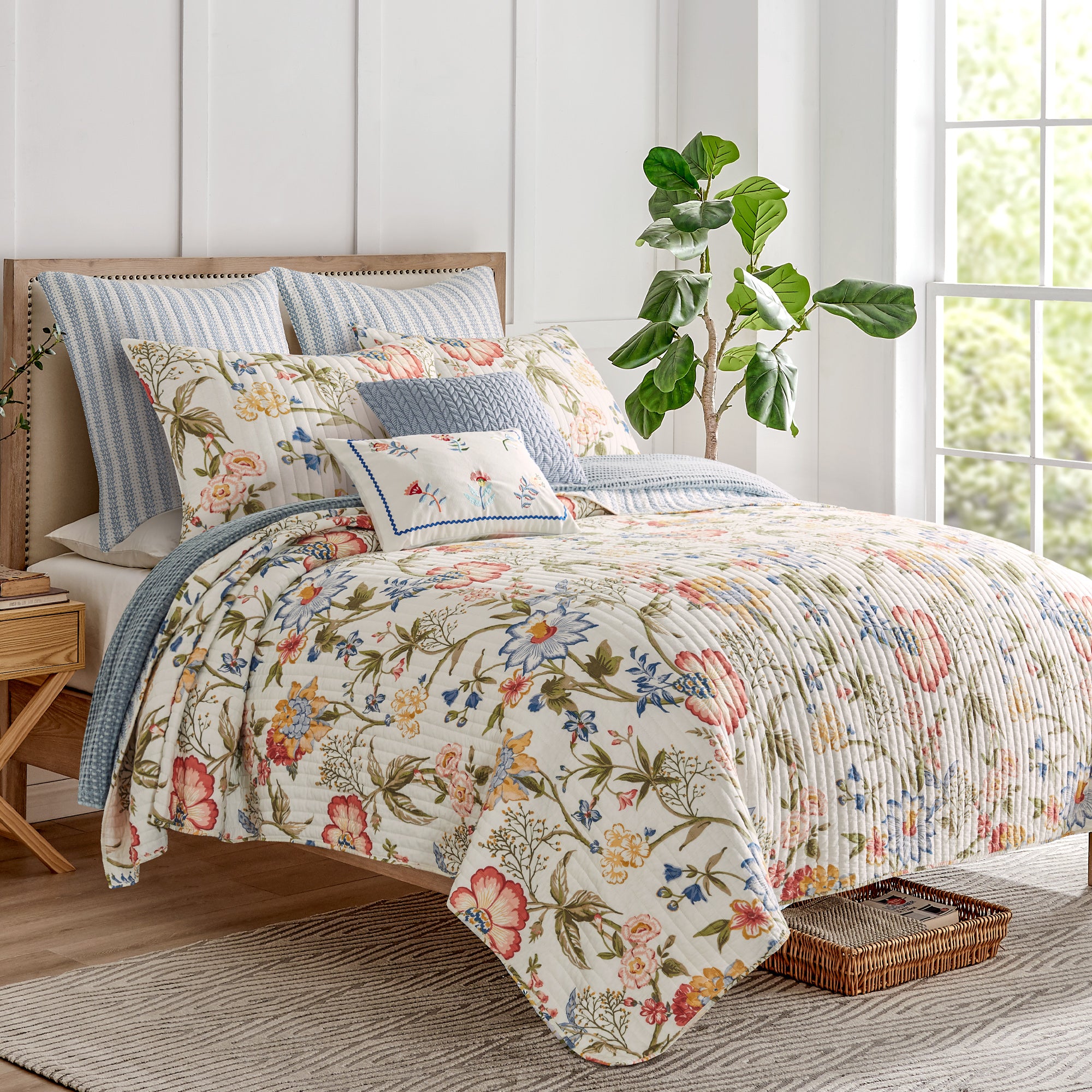
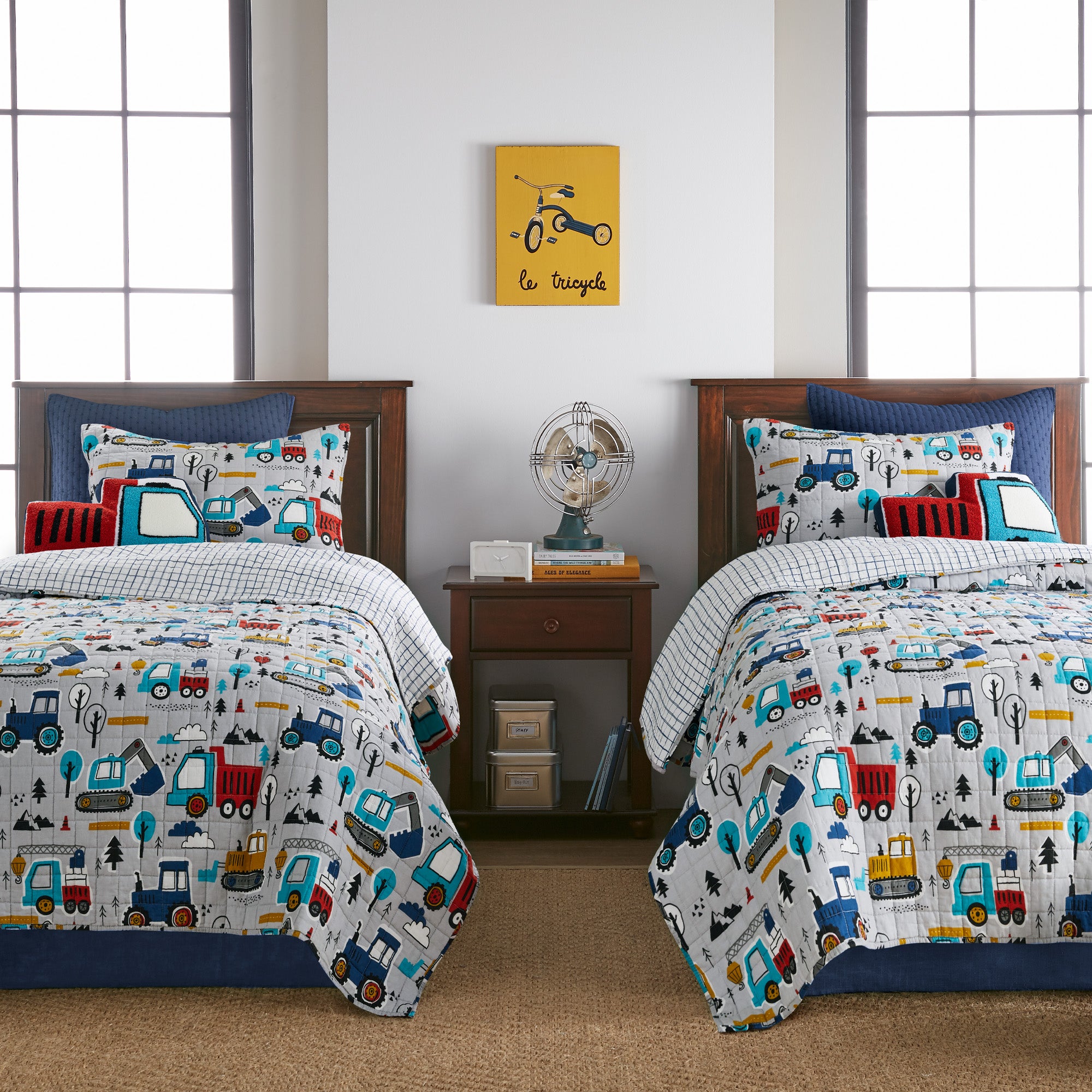
Want a little whimsy as your base layer? The delicately ruffled Wilhemina Quilt Set in White should be your go-to. Need a little more structure? Try our Ballou Quilt Set in Bright White.

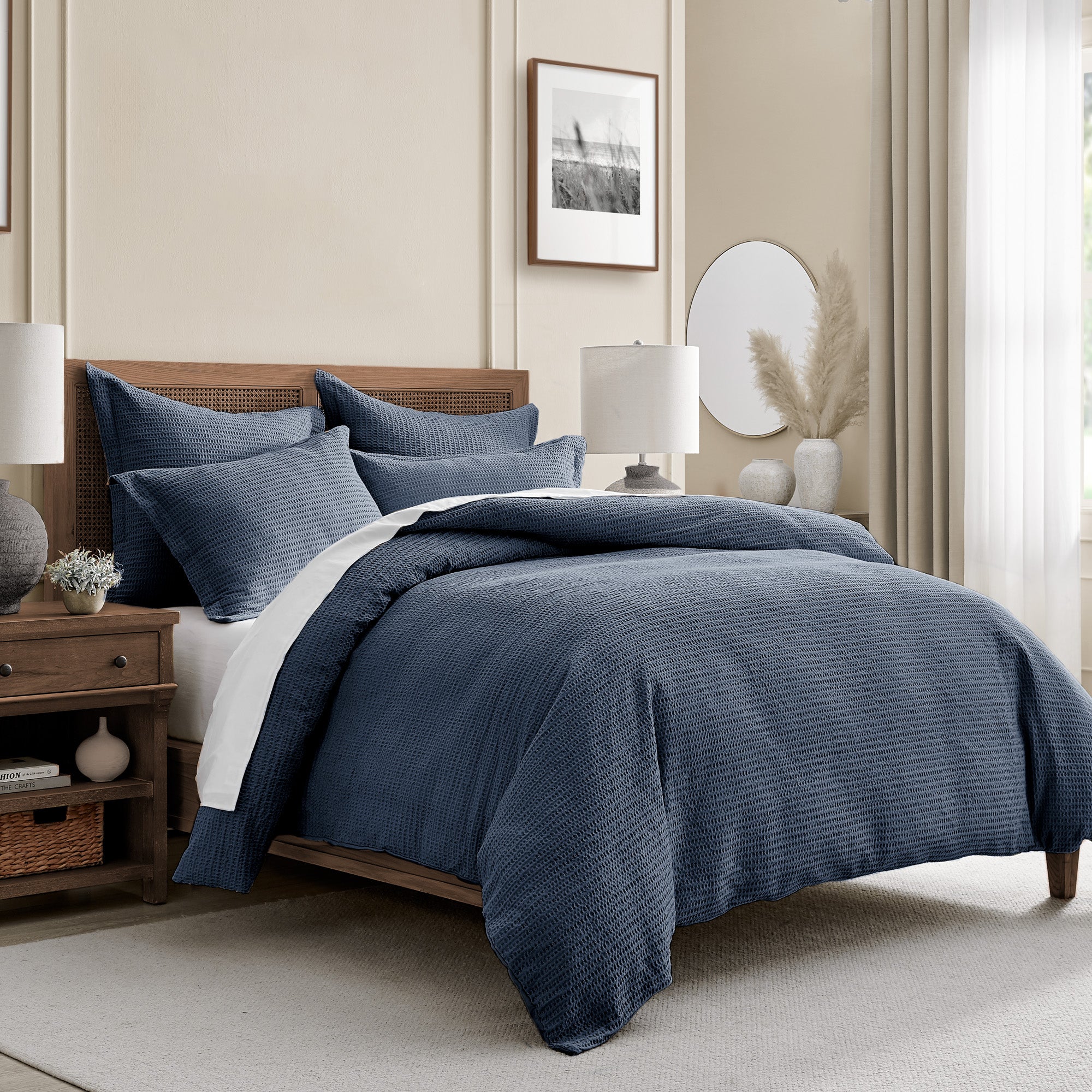
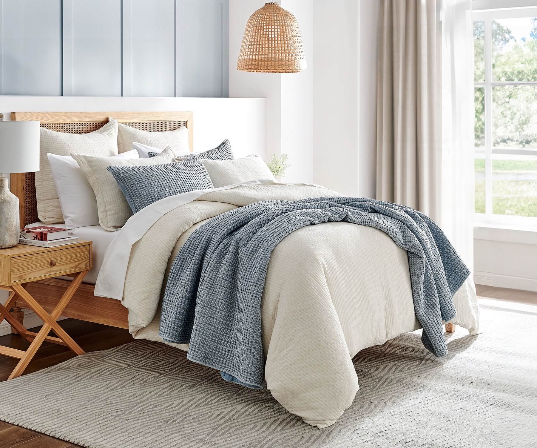
Benjamin Moore’s Color of the Year 2026: Silhouette AF-655
Benjamin Moore named Silhouette AF-655 as its 2026 Color of the Year, and it’s a strong one.
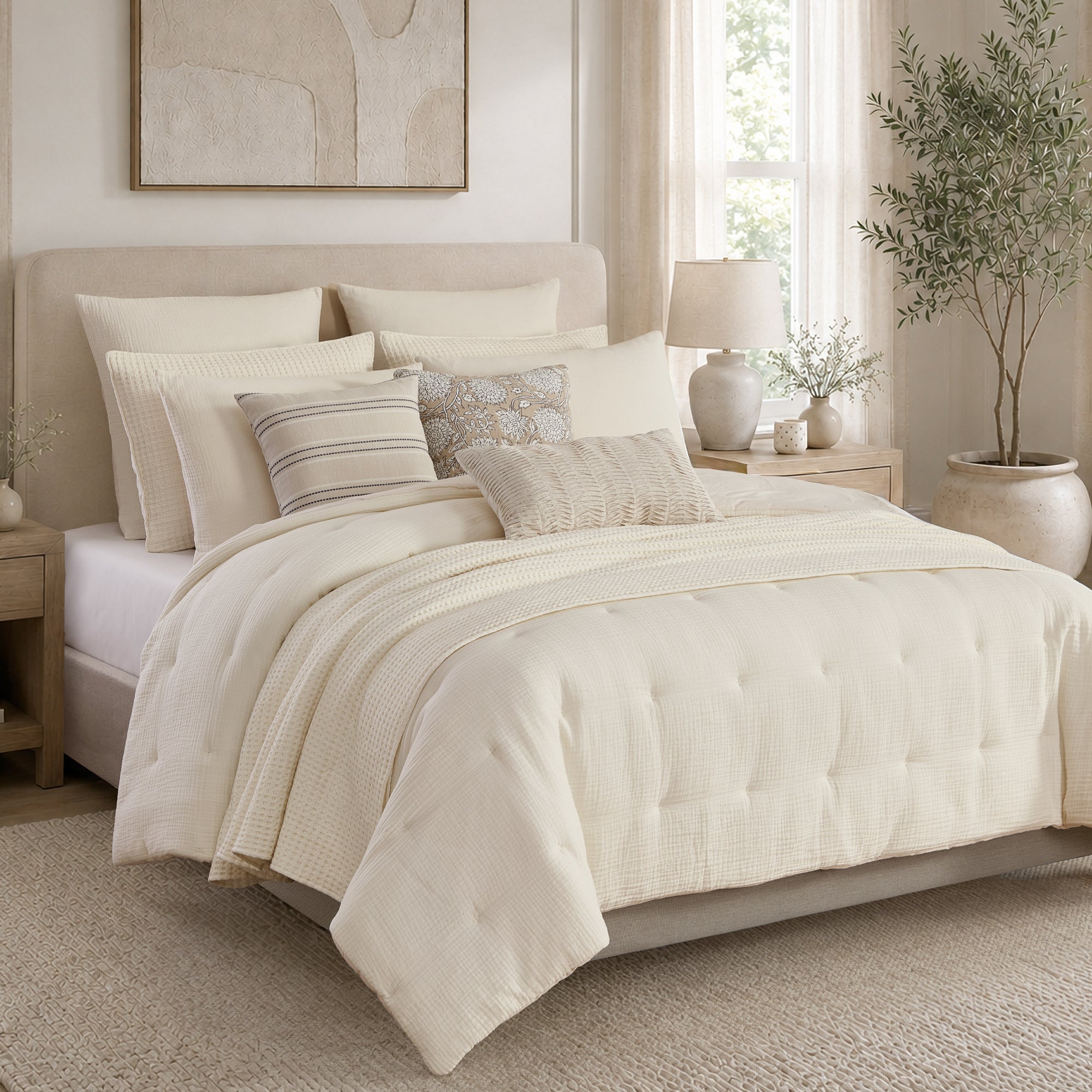
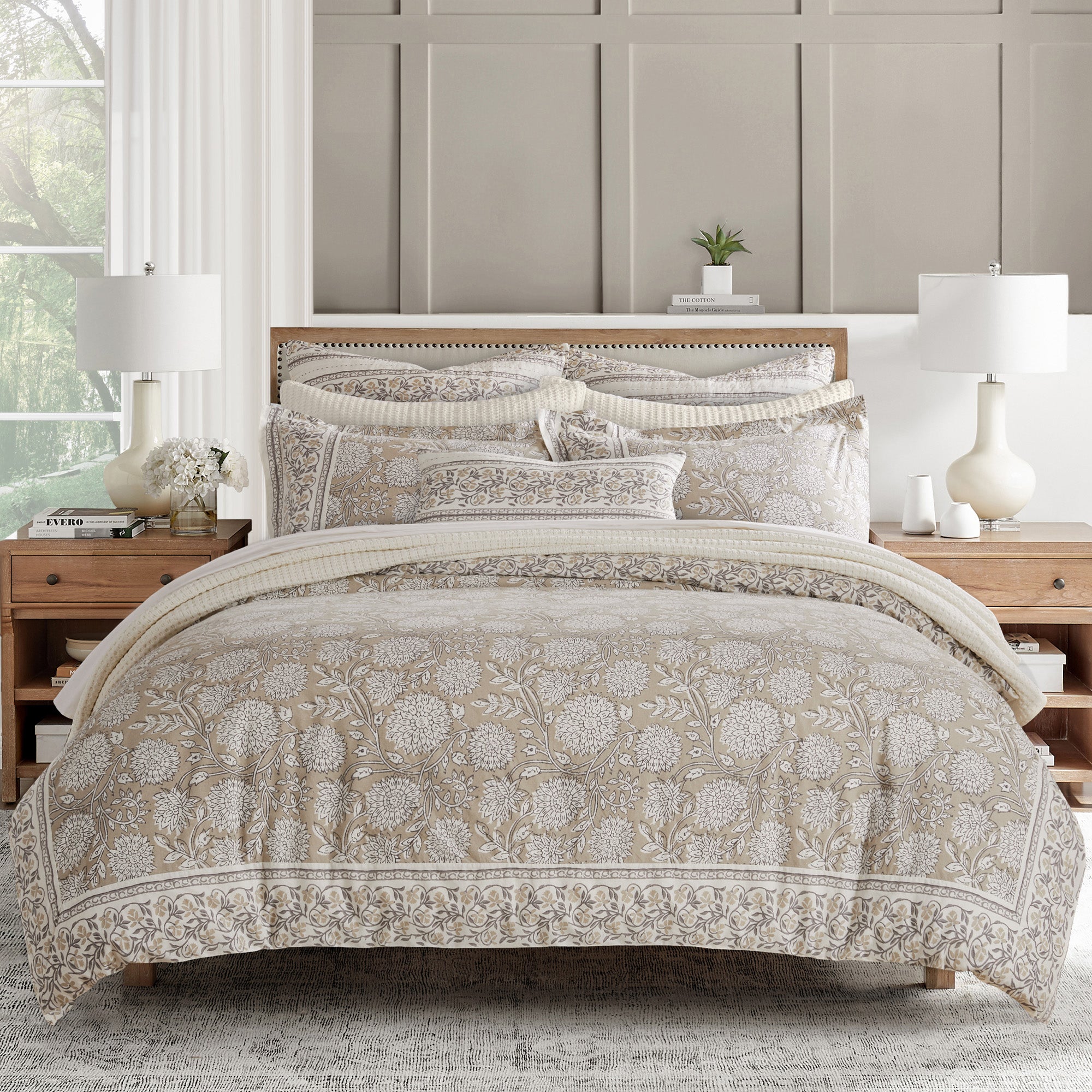
Silhouette is a deep, espresso-toned brown with subtle charcoal undertones. It’s rich, grounded, and quietly dramatic, the kind of color that makes a room feel intentional without trying too hard.
This is not a trend color you tiptoe around. It’s a confidence color. It works beautifully in dining rooms, bedrooms, libraries, or anywhere you want the space to feel settled and finished.
Paired with a soft white like Cloud Dancer, Silhouette brings depth without heaviness. It’s dramatic in a grown-up way. No mood swings. No buyer’s remorse.
Our recommendations:
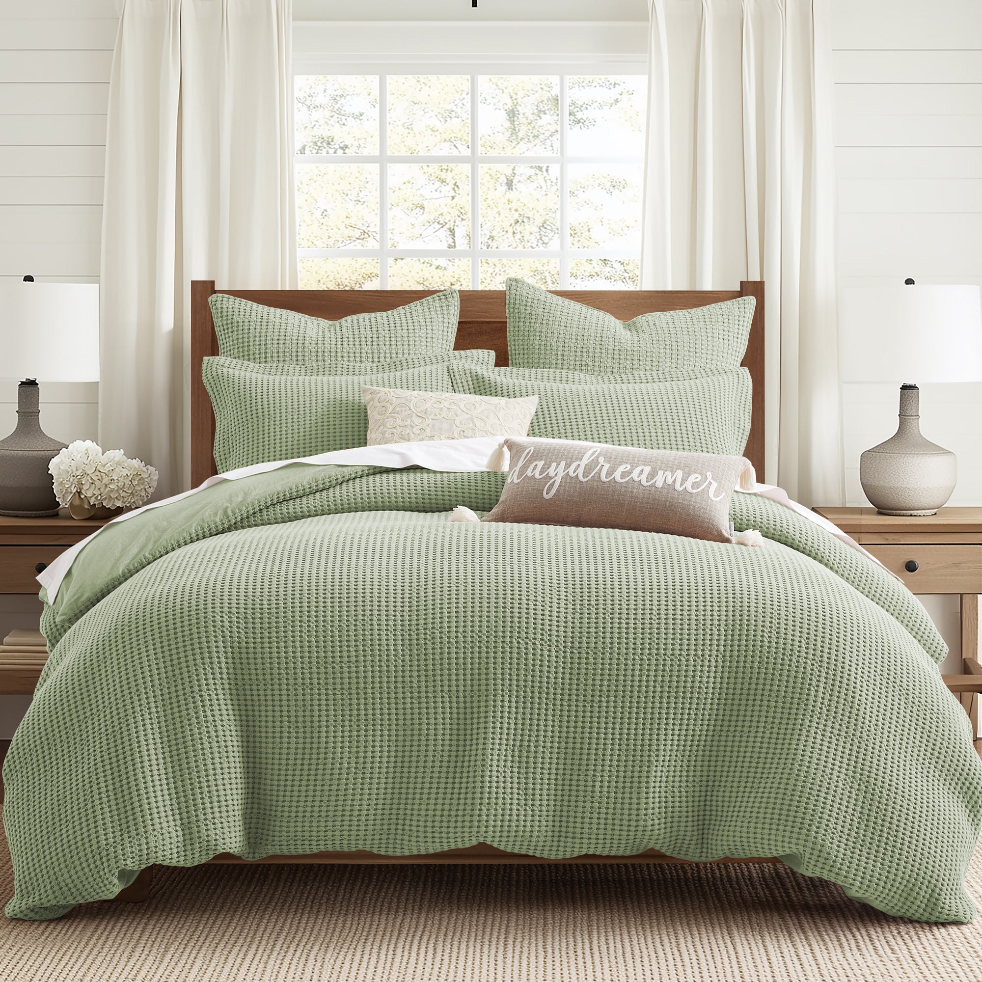
- French Flax Washed Linen Duvet Cover in Cocoa makes the perfect base for layering on more color and texture.
- Our Adare Quilt Set in Cocoa or Taupe is ideal for making it all a bit more interesting.
- For an added layer, toss on our Mills Waffle Quilted Throw in Cocoa.
Sometimes, the advice is to look in your closet, and determine the colors that you feel best in, and use that as almost the starting point for the colors that you would use when you’re designing your home.- Andrea Magno, Benjamin Moore Color Marketing & Development Director

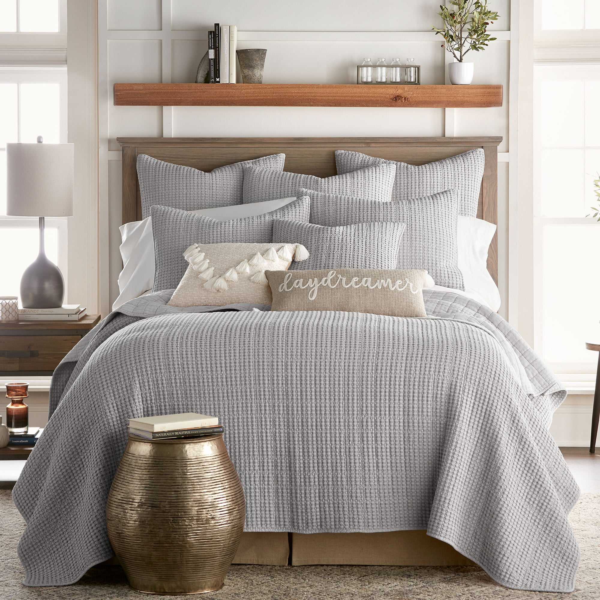
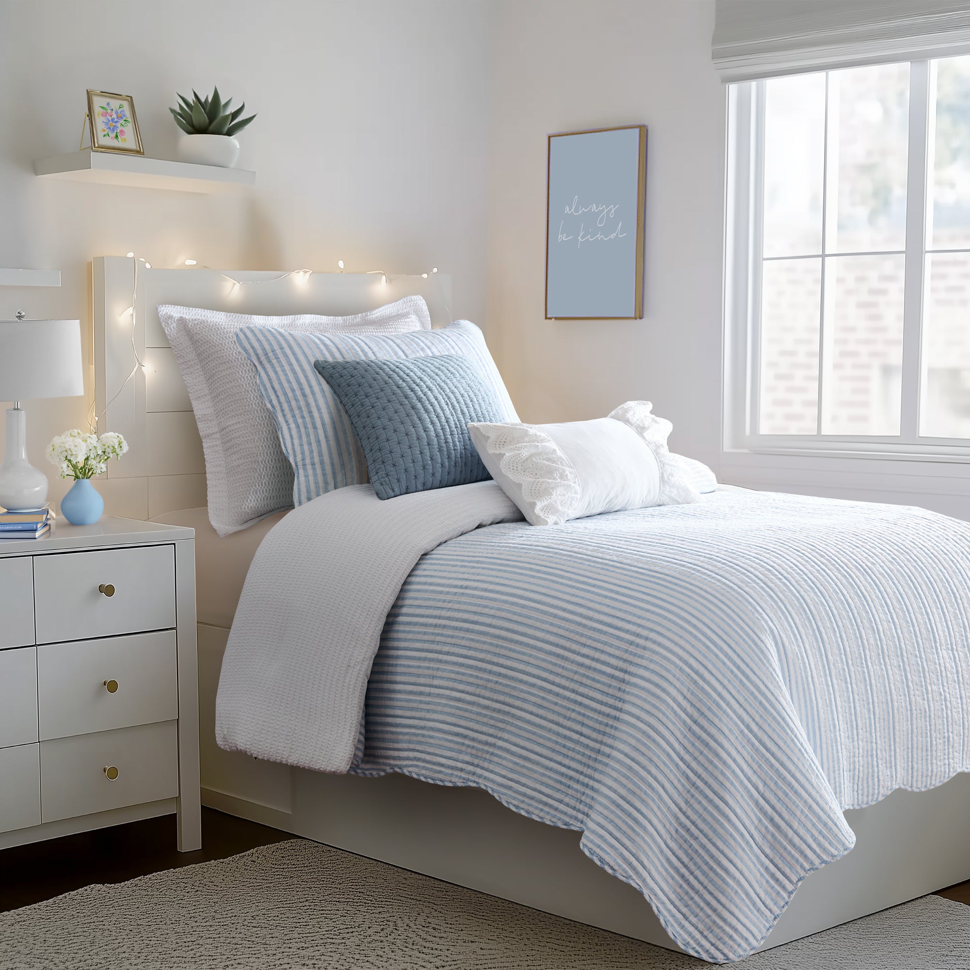
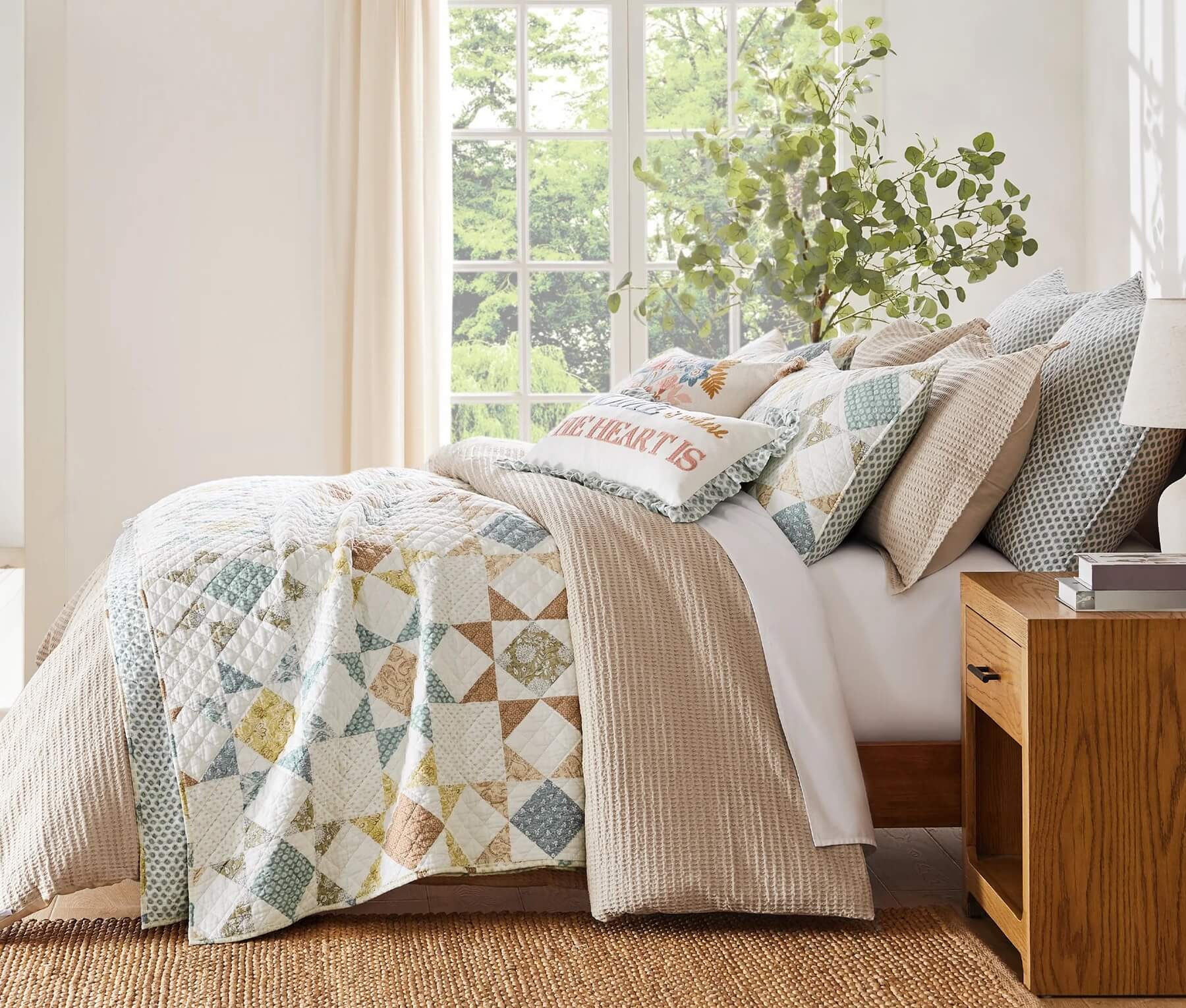
Sherwin-Williams’ Color of the Year 2026: Universal Khaki SW 6150
Sherwin-Williams chose Universal Khaki SW 6150, and the name tells you everything you need to know. This is a color for real life.
Universal Khaki sits comfortably between beige and tan, with warm undertones that make it incredibly flexible. It works in open-concept spaces, traditional homes, modern interiors, and anywhere in between.
If you’ve ever painted a room something “interesting” and then spent the next month trying to talk yourself into liking it, this color is your reset button. It plays well with soft whites, natural wood tones, and furniture you already own, which matters more than trends ever will.
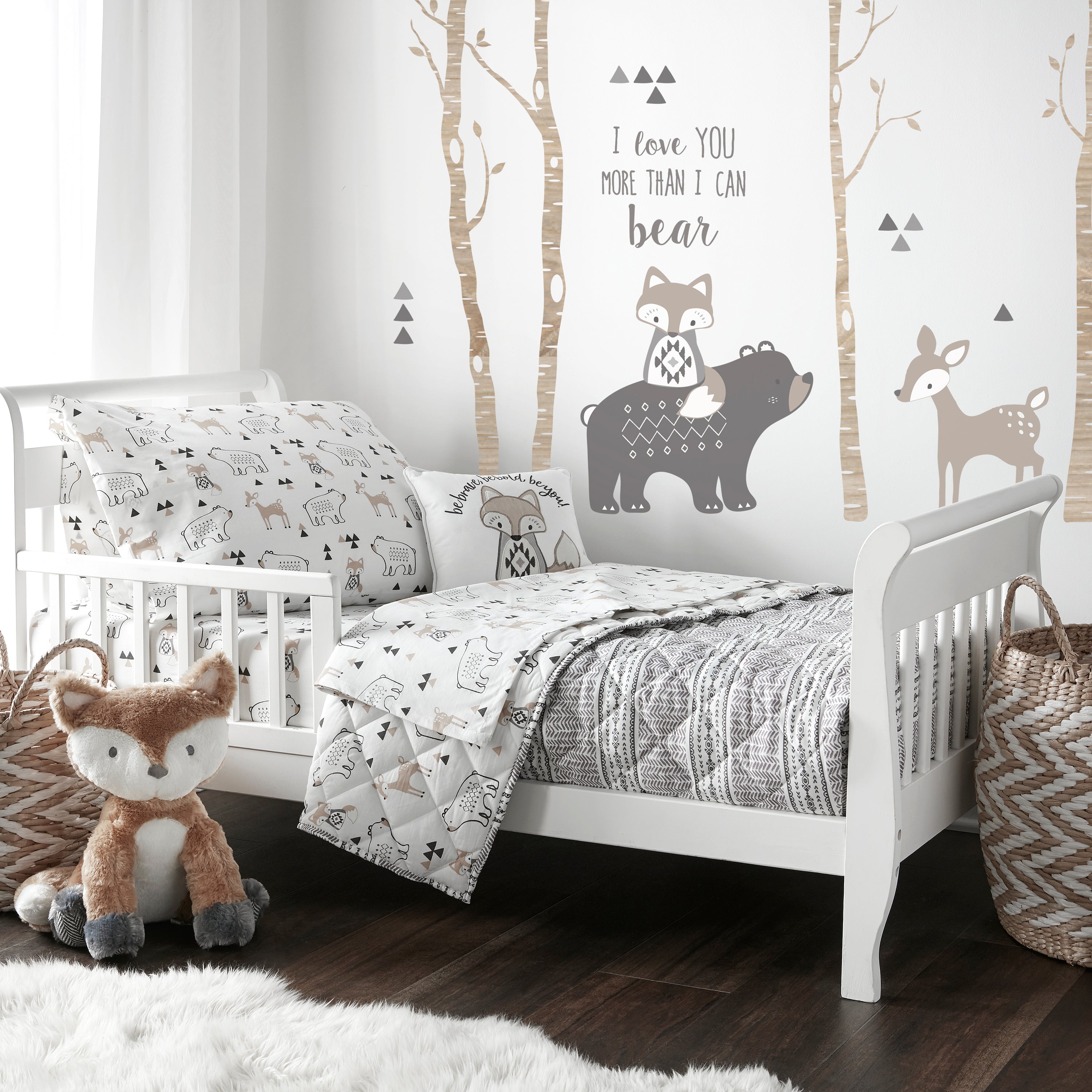
Is Universal Khaki your go-to? Start with our Cloud Waffle Comforter Set in Taupe - then add a throw pillow or two - like our Adare Taupe Quilted Throw Pillow. Want to add a little texture? The Muslin Stitch Euro Shams in Taupe are a great choice! Baby on board? The Cloud Muslin 5pc Bedding Set in Cocoa/Beige will have them sleeping in style.

Behr’s Color of the Year 2026: Hidden Gem
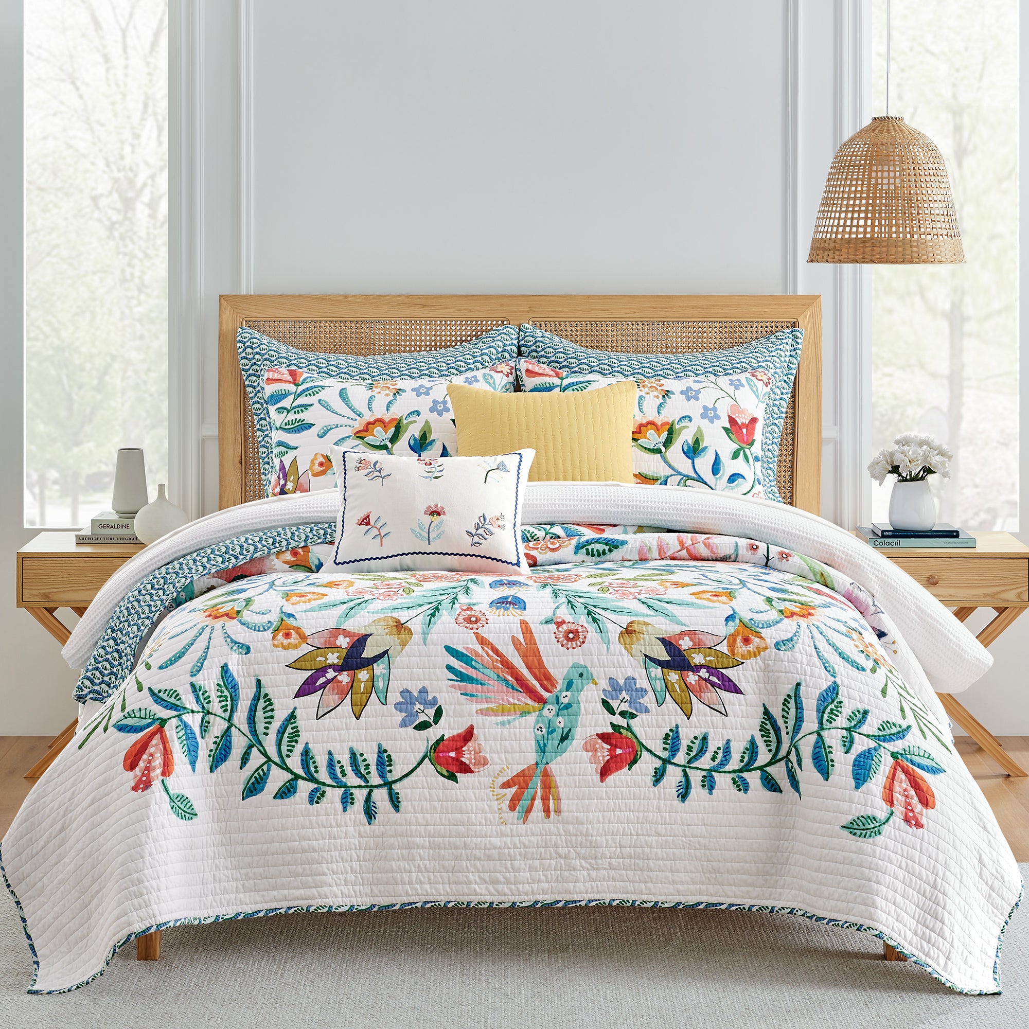
Behr selected Hidden Gem (N430-6A) as its 2026 Color of the Year, and this is where the palette gets a little personality.
Hidden Gem is a smoky blue-green with jade undertones. It’s calming without being cold and bold without being loud. This is color for people who want something interesting - but not exhausting.
It works especially well in bedrooms, home offices, and bathrooms, where calm matters more than drama. Paired with Cloud Dancer or other soft whites, it feels balanced and intentional. Think spa, not a statement wall you’ll regret.
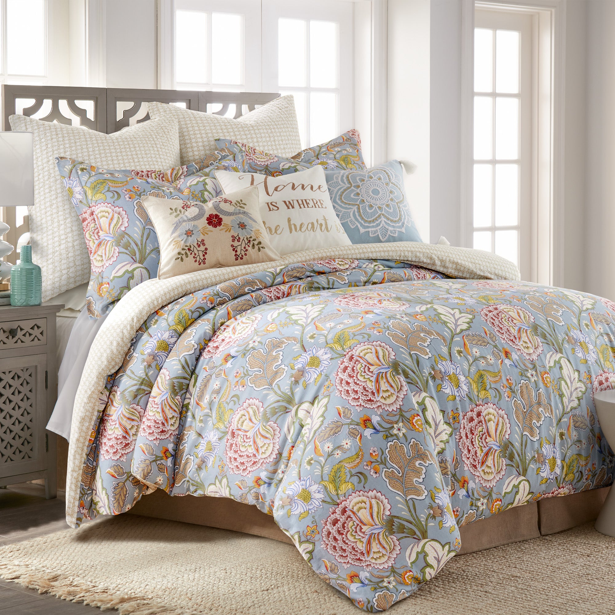
Want to translate this blue-green into the perfect spring bedroom? Our Angelica Comforter Set in Off-While is a refreshing way to use Hidden Gem without it being overwhelming.

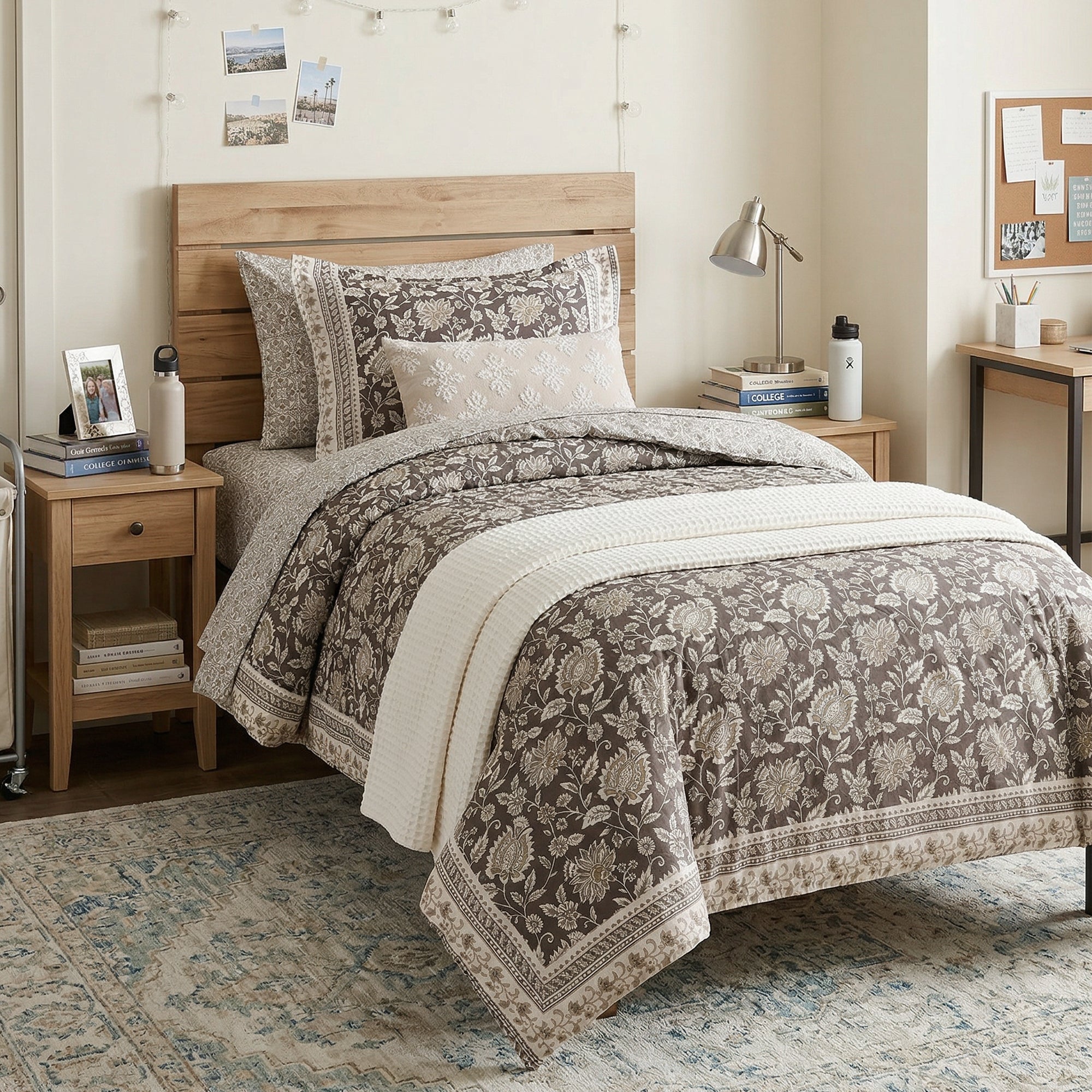
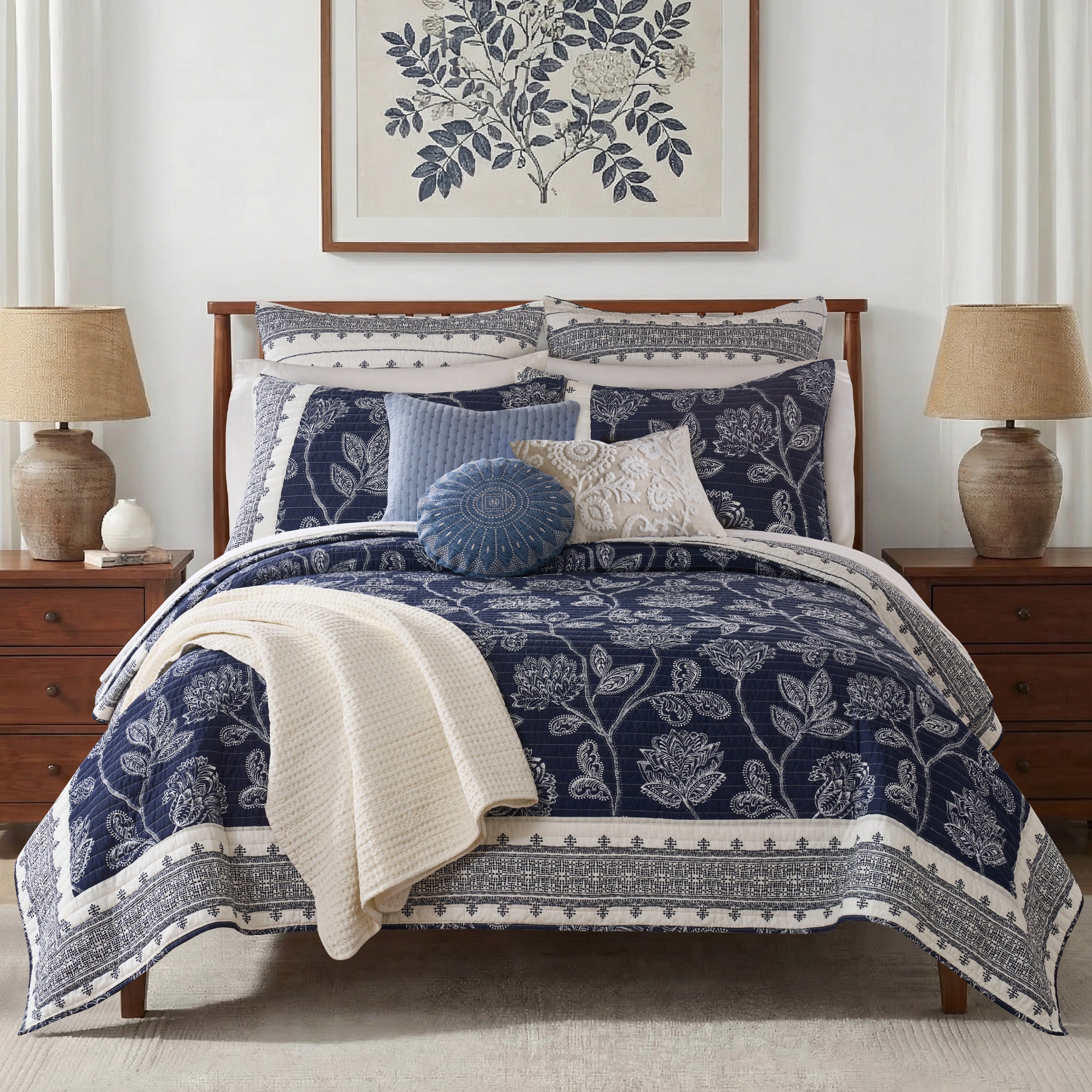
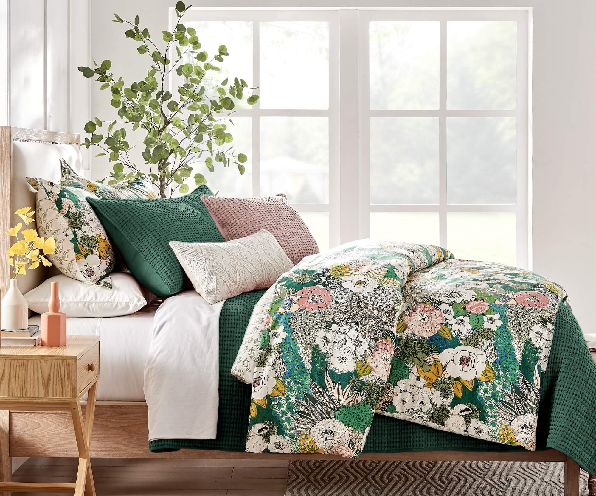
Farrow & Ball’s 2026 Color Direction: Naperon
Farrow & Ball doesn’t really do “Color of the Year” the way everyone else does. They focus on direction, not declarations.
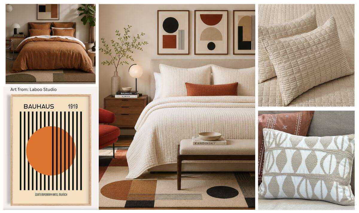
For 2026, Naperon stands out. It’s a warm, peach-leaning terracotta with real depth. Not sweet. Not trendy. Just grounded and timeless.
This is a color that changes with the light and never looks flat. It works beautifully in kitchens, dining rooms, and entryways - especially in homes that lean toward collected rather than curated.
Paired with Cloud Dancer or other soft whites, Naperon adds warmth without overwhelming a space. It feels lived-in in the best way.
Our picks:
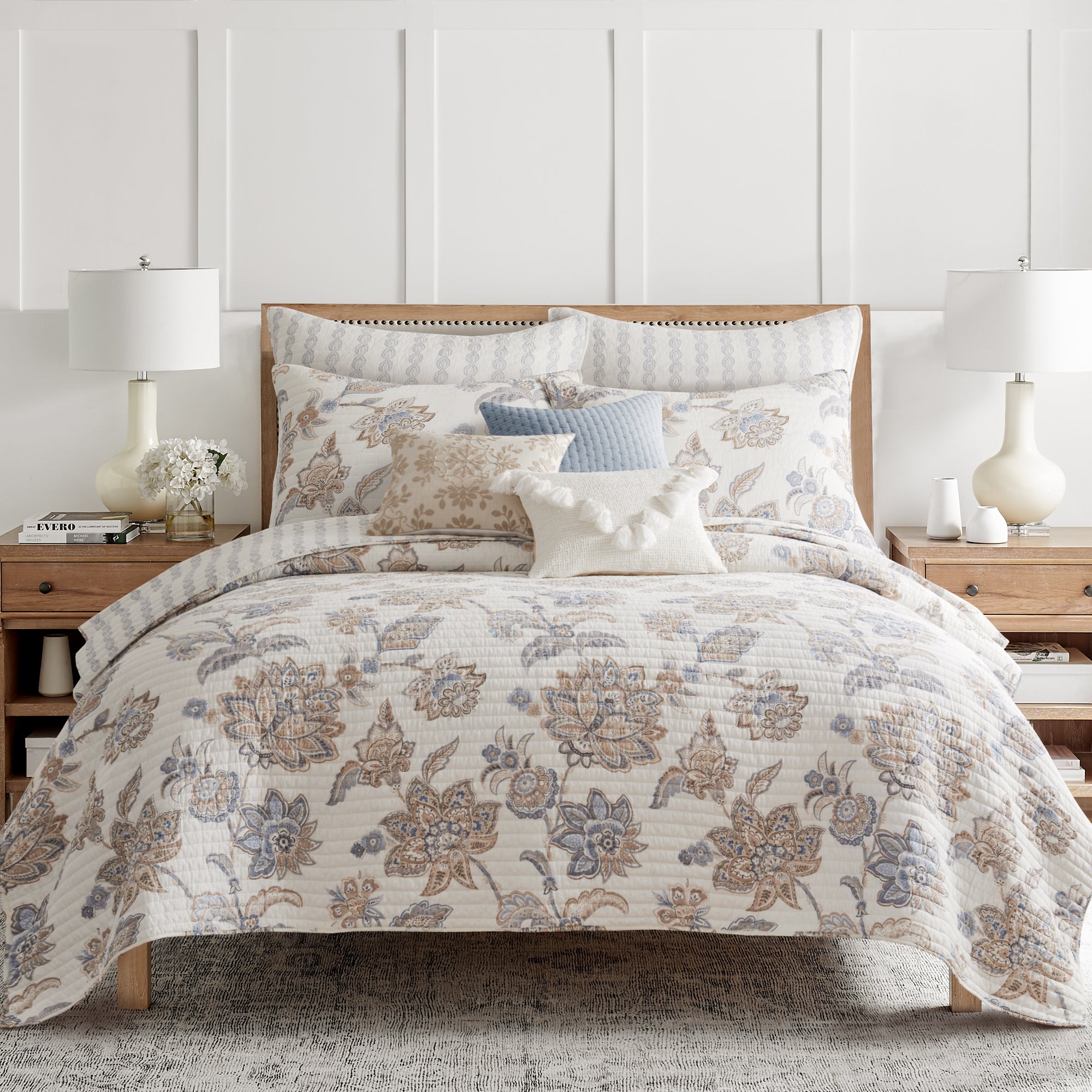
- Our Selesta Quilt Set in Blush adds just a touch of this grounded peachy-pink without being overwhelming.
- Love layering? The Mills Waffle Quilt Set in Blush adds that extra pop of color and texture for a picture-worthy bedroom that’s as comfortable as it looks..
How the 2026 Colors of the Year Work Together
When you look across all of the 2026 Color of the Year picks, a clear message emerges.
This isn’t about choosing a color. It’s about building a palette that supports how you live.
At the center is Cloud Dancer, acting as a soft, breathable foundation - not a feature, not a fallback. It creates light and space so richer tones can coexist without feeling heavy.
From there, the rest of the palette layers in naturally.
- Deep browns like Silhouette ground the space.
- Warm khakis soften transitions and tie rooms together.
- Muted blue-greens add calm and visual relief.
- Terracotta and clay tones bring warmth and life.
Together, these colors create what designers are calling Earthy Vibrancy - a look that feels rich, warm, and expressive, but never loud. The palette works because nothing is trying to dominate. Each color has a role, and each one makes the others better.
This is color that understands balance. A light base. A mix of grounded, livable hues. And enough restraint to let texture, materials, and everyday life take the lead.
These are colors designed to live with you, not just perform for Instagram.
Decorating With the 2026 Colors of the Year at Home
Here’s the good news: you don’t need to repaint your entire house to work with the 2026 color palette. This is a year for layering, not overhauling.
Paint is where you commit. Textiles, bedding, and décor are where you play. That’s where color can shift with the seasons, your mood, or the next thing you decide you’re into, without the emotional labor of repainting.
A soft, light foundation like Cloud Dancer still matters. It keeps rooms feeling open and balanced while richer tones — browns, khakis, blue-greens, and clay hues — layer in around it naturally.
Your tastes will change. They always do. The 2026 palette is built to move with you, not fight you.
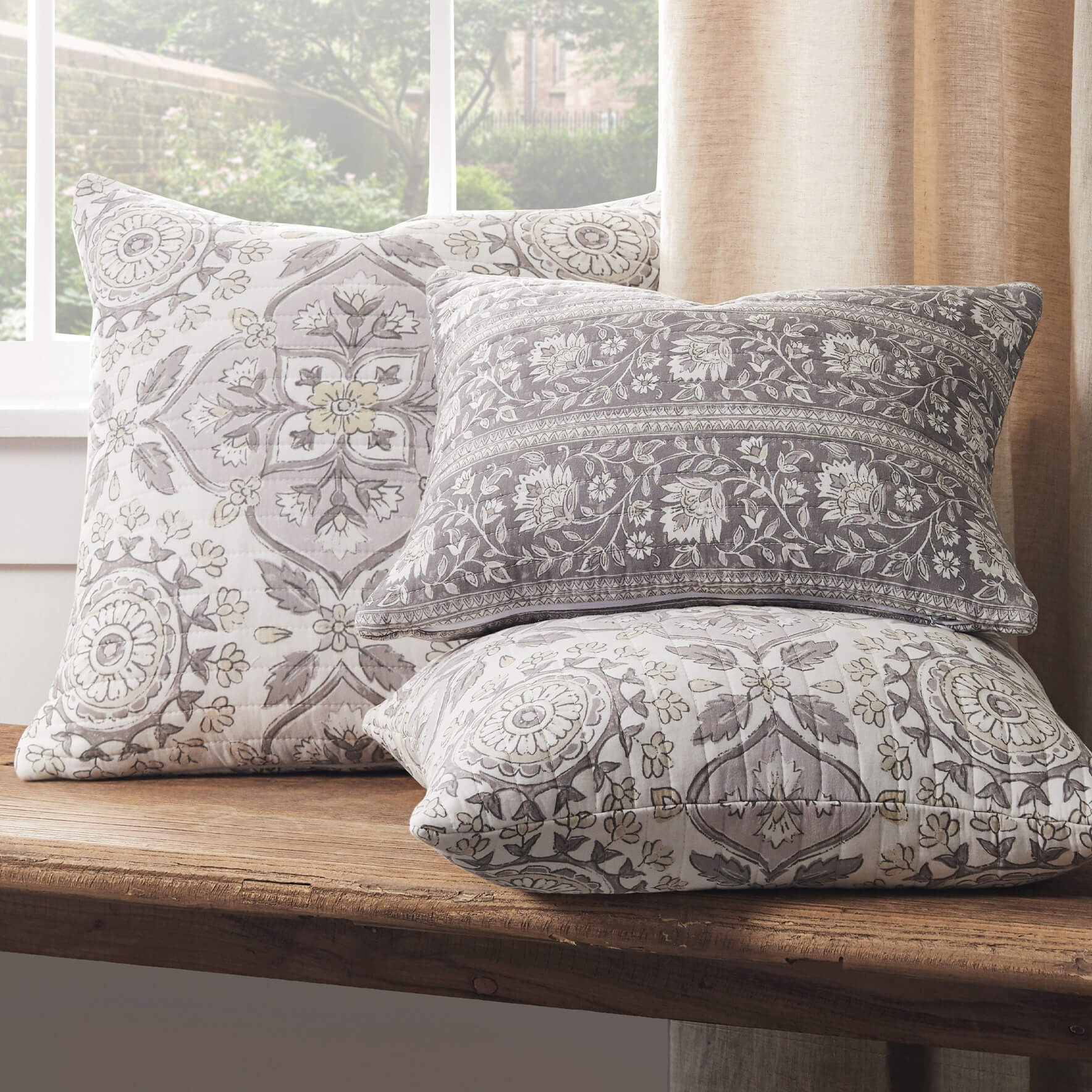
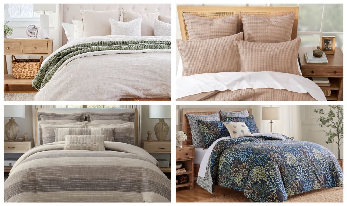
Bedding & Textiles Inspired by the 2026 Color Palette
The 2026 color palette shows up in bedding and textiles in a way that feels intentional, not overdesigned.
This is where rich browns, warm khakis, muted blue-greens, and soft terracotta tones come into play, grounded colors that add warmth and depth without taking over the room. These shades work best when they’re layered, not isolated.
Cloud Dancer still has a role, but it’s the supporting act. It gives the eye a place to rest so deeper tones like espresso brown or smoky jade can actually shine.
Think:
- Espresso or chocolate-toned quilts paired with soft white sheets
- Khaki or sand-colored coverlets that warm up a room without going yellow
- Muted blue-green shams or throws for calm contrast
- Terracotta or clay accents that add warmth without feeling trendy
Bedding that complements your wall color can establish a cocooning, cohesive design that celebrates a favorite shade… whereas opting for bedding in a different color can create a more colorful and visually interesting space.- Zara Stacey, content editor of Homes & Gardens magazine
Texture matters more than pattern here - quilted cottons, matelassé, washed linen - fabrics that add dimension without visual noise. The result is a bed that feels layered, grounded, and lived-in, not styled for a photoshoot.
These are colors you don’t get tired of because they’re doing a job: adding warmth, balance, and a sense of calm, night after night.
Interior Design Styles That Pair Best With the 2026 Colors of the Year
These colors work especially well in styles that value balance over boldness:
- Modern organic interiors
- Coastal spaces that lean calm, not nautical
- Transitional homes that mix old and new
- Spa-inspired bedrooms and baths
- Minimalist spaces that still feel warm
If your style prioritizes comfort, longevity, and ease, you’re right on trend.
How Long Will the 2026 Colors of the Year Stay Relevant?
Colors of the Year typically influence interiors for two to four years. Neutral-leaning palettes like this one tend to last even longer.
Cloud Dancer and its companion colors aren’t designed to expire. They’re meant to adapt. That makes them smart investments, especially for foundational elements like paint, bedding, and textiles.
Trends come and go. Colors with good judgment stick around.
FAQ
What is Pantone’s Color of the Year for 2026?
Cloud Dancer (PANTONE 11-4201), a soft, calming white. Selected by the Pantone Color Institute, this year color reflects a global shift toward balance and restraint, reinforcing white as a grounding hue Pantone experts believe will influence color palettes throughout 2026.
Are the 2026 Colors of the Year warm or cool?
Overall, warmer. Even deeper shades lean grounded rather than stark, aligning with the broader world Pantone forecast that favors earthy, calming influence over high-contrast trends seen in previous years.
Do paint brands make Cloud Dancer equivalents?
Yes. Many offer soft whites with similar undertones, though exact matches vary. While the official Pantone color is unique, several brands develop comparable shades inspired by the 2026 color palette, making it easier to bring this versatile white into your home.
Can you mix Colors of the Year?
Absolutely. That’s the point. These colors are designed to work as palettes, not solos, allowing you to layer the Pantone Color of the Year with complementary hues for 2026 in a way that feels cohesive rather than overly coordinated.
References
1. Benjamin Moore Announces the 2026 Color of the Year—and It’s a Rich, Warm Neutral,
House Beautiful
2. 'Earthy Vibrancy’ Is Poised to Become 2026’s Defining Color Trend,
Good Housekeeping
3. Should your bedding match your wall color? Designers argue the case and explain the effects,
Homes & Gardens
4. A Whisper of Tranquility and Peace in a Noisy World,
Pantone
5. Silhouette,
Benjamine Moore
6. SW 6150 Universal Khaki,
Sherwin-Williams
7. 2026 Color Of The Year Hidden Gem,
Behr
8. No. 315 Naperon,
Farrow & Ball